Games
PCB
Archive
Chip
Archive
Cart/Box
Scans
Articles
Peripherals
Prototypes
Unreleased
Games
Rarities
Homebrew
Emulation
Links
Email: snes_central@yahoo.ca
Legend Of Zelda, The: A Link to the Past |
 In this article, I investigate the origins of the Link to the Past beta screens that were shown in various media outlets! Thanks to Tongueman for the Famicom Magazine scans, and Retromags for the others! By:
Evan G
|
I remember back in 1992 when I first got the Super Nintendo, and immediately was drawn to the poster that came with it that showed screenshots for The Legend of Zelda - A Link to the Past. The game looked awesome. Needless to say, this was the first game we wanted to get. And it certainly delivered. A Link to the Past is rightly regarded as one of the best games ever made. However, I always looked at the screenshots on the poster and thought "these don't look right, these scenes are not like this in the actual game!" Now that I am a certified SNES prototype expert (hehe), I now know that these were from an early version of the game. A quick inquiry about this, and I now know all about it!
The Link to the Past beta screenshots made their rounds in US video game magazines. The were especially prominent in EGM and their sister publications (particularly EGM August 1991 and the Winter 1991 Super NES Buyer's Guide). They also appeared in the July and August issues of Nintendo Power. I would suspect the poster I got with my SNES was made up for the launch of the system, which was in late August 1991.
However, the first publication of these screenshots was in Famicom Magazine. In the article (see below), they state that they were given to the magazine by Nintendo at the Third Shoshinkai event, which happened April 24 - May 6, 1991. A Link to the Past came out in Japan on November 21st, 1991 (if Wikipedia can be trusted), so these screens date to at least 6-7 months before release.
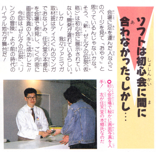 |
| The picture caption reads "初心会会場で秘かに画面写真を入手! 左が任天堂の本郷氏なのだ", which roughly translates to "At Shoshinkai, we secretly received these screenshots! To the left is Mr. Hongo, a Nintendo employee". |
The Famicom Magazine screenshots are the highest quality of these beta screens. Apparently EGM used to just scan Famicom Magazine for screenshots in their articles, and they show an obvious degredation in quality. The Nintendo Power screens are also not as great, but you would have to assume they had access to the same plates. Due to this, all of the comparisons below are from the Famicom Magazine scans. These are untouched scans, and likely have some colour quality problems. I would expect that the colours should be the same as in the final release, but I can't say for sure this is the case. One thing to keep in mind is that these are from photo plates - it appears that Nintendo did not even have a playable version of the game at Shoshinkai! The rest of the text in the above scan makes reference to the game being delayed, something that became a running problem for Nintendo in the 90s.
Anyways, onto the screenshots. All of the screenshots are from the first part of the game in the Light World, covering the initial raid of the castle, the first and second dungeons. I'll try to go through these in the order in which you would play them. In order to facilitate the comparison, I've stretched the screenshot taken from the emulator to be in the proper dimensions that would be seen on a TV.
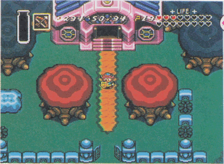
1) Raining at the Sanctuary
 |  |
| beta | final |
 |
| comparison GIF |
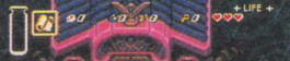
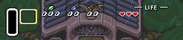
First thing to investigate is the entrance to the Sanctuary. It is raining! In the final game, it is not possible to get here when it is raining, so I had to use a cheat code. It appears that originally, they intended for Link to enter the castle via the Sanctuary (whereas in the final, this is only the exit). The main change to this area is that the fence on the right side of the path was moved one tile to the right, and an extra bush was added.
As for some more general observations, the status bar at the top of the screen was overhauled for the final version of the game. The magic bar lost its bottle-like shape, and the numbers for rupees, bombs arrows moved below the icons. The overworld no longer shows how many keys you have. The rupee icon was changed to a green colour in the final version. The arrow icon was also changed, but this particular screenshot makes it hard to assess. The "life" line has plus-signs in the beta, and were changed to lines. There are several changes to sprites, but I will illustrate those further down. One thing I will point out is that Link's sprite has changed so that his pants are longer in the final version. Another thing I will point out, as this was common in all of the screens I compared, is that it appears that the entire screen was shifted by half a tile to the left in the final version of the game. Not sure why this was done. Finally, there is a "letter" item in the beta version of the game, which is not used in the final version. According to The Cutting Room Floor, this item occupies the same item slot as the Mirror, and they speculated that it may have been used to acquire the Mirror. Considering that the beta version has this item at the start of the game, I think it actually was used to gain entrance to the castle via the Sanctuary. The item looks the same as the map in the final version.
 |  |
| beta | final |
 |  |
| beta | final |
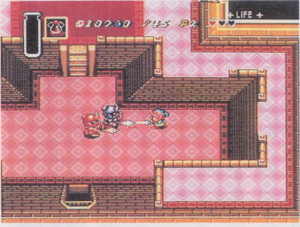
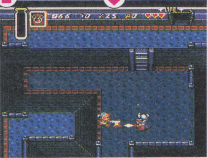
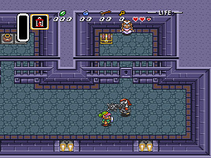
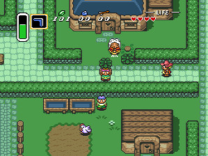
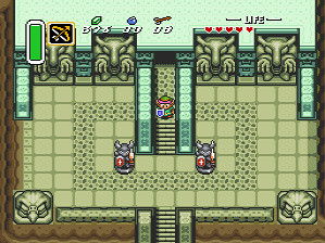
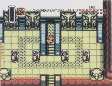
2) Main room of the castle
 |  |
| beta | final |
 |
| comparison GIF |
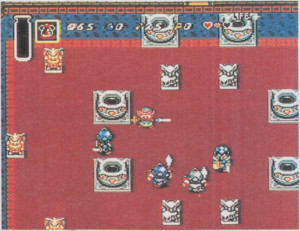
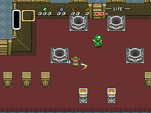
This scene was so different from final, that I initially didn't initially know where it was. In the beta version, there is an extra "chasing" soldier. They appear to be blue in the beta, but this could just be because the screen was captured when they got hit. Their swords have been changed to be straighter in the final game. Other than that, it looks like the soldier sprites are the same. Link has a larger range of motion in the beta version (allowing the sword to go completely horizontal to the screen), and the shield appears to be different. The mouth of Link might be different, but that could just be a glitch in the screenshot. The room itself is completely re-arranged, and I used the pot beside link as a point of reference. The pot sprite is completely changed. The grey statutes and two pots have been replaced with lanterns, and there are some brown statues that are not in the final version of the game (in any place, I believe). There are some pillars added, and secondary stairs on the left. The wall has also been moved down, covering up the blue area at the top of the screen. I tried to align the soldiers to be the same as the beta screenshot, but the chasing soldier would be overtop of the lantern.
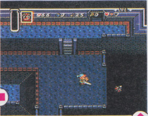
3) Throne room
 | 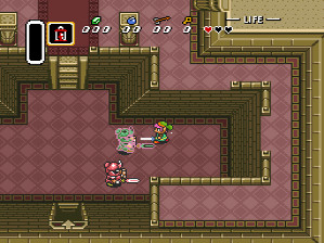 |
| beta | final |
 |
| comparison GIF |
Compared to the previous scene, this room is pretty much unchanged. The door has an added arrow and stairs in the final version. Other than that, the layout of the room is pretty much the same. The pattern on the floor has been changed to be somewhat simpler, without the secondary circle in the light panels. The carpet on the second level is wider in the beta, and there aren't any pillars. In this scene, Link is attacking with a charged sword, indicating that this gameplay aspect was present in the beta version. Also notable is the lantern item, which went through a substantial change between the beta and final version. Link's sprite was also changed to make him have larger eyes in the final version.
4) Castle basement
 |  |
| beta | final |
 |
| comparison GIF |
Not really that much different in the basement, except that the floor texture has been changed.
 |  |
| beta | final |
There is a second screen of this room, showing the soldier falling down the pit. There is a wall added to the bottom right of the screen in the final game.
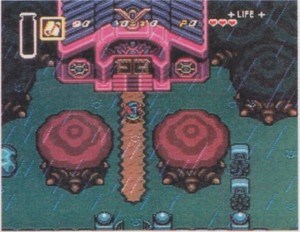
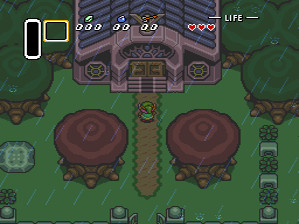
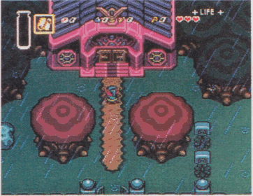
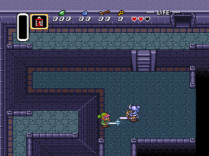
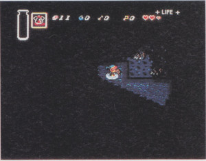
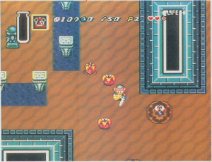
5) Castle dungeon
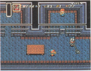 |  |
| beta | final |
 |
| comparison GIF |
Quite a bit was changed in the dungeon. The sprite for Zelda may not have been complete for the beta, and instead a regular maiden was used. This particular maiden can be seen in the introductory movie. The table was moved to the left of this area, probably to make it easier to fight the guard. The guard itself gained a red mane on its head. The extension of the spiked ball and chain shown in the beta is not actually possible in the final version when the guard is facing left. Pots were added to the left cell, and a treasure chest added to the right cell. Lights were added to the southern wall. A texture as added to the top of the walls.
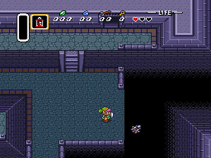
6) Secret passage
 | 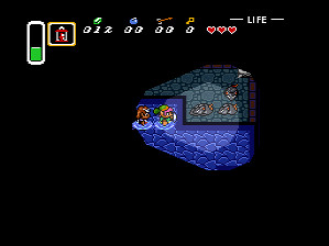 |
| beta | final |
In the final version, the range of the torch in darkness was changed. Also, Zelda does not follow you in the beta. The rat enemies look like they are unchanged.
7) Sanctuary after rescue
 | 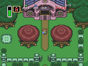 |
| beta | final |
 |
| comparison GIF |
As an elaboration to the first screen investigated, there are several graphical changes in front of the Sanctuary. The ball on top of the gate posts is slightly larger in the beta. The large rock is changed. Oddly, the beta version seems to have a perspective similar to the other objects on the map, while the final version has a flat top. Link's shield is a different colour. I would guess that originally it was envisioned as a wooden shield.
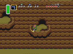
8) Kakariko Village
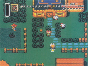 |  |
| beta | final |
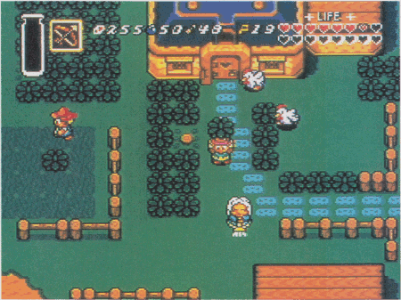 |
| comparison GIF |
Kakariko Village is extremely different in the beta. I tried to use the broom woman's house as a reference. Lots of things are in different places in the beta. The palette used for the NPCs was obviously different, they have blue clothes instead of red. Even the house is a bit different - the extension on the side is wider, there is a second floor window, and the door has obvious hinges. Link's "carrying bush" sprite looks about the same as in the final version. The beta has a lot of wooden fences, while the final version has stone hedges. The blue haired boy is not in this area in the beta.
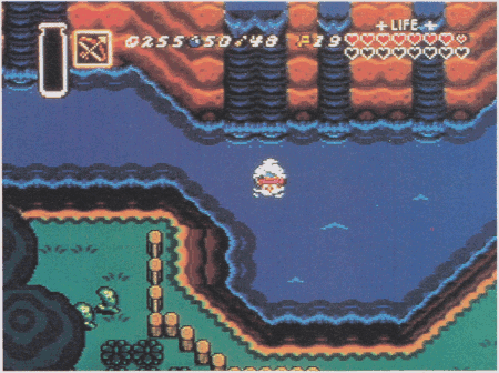
9) Bridge to the Witch's Hut
 | 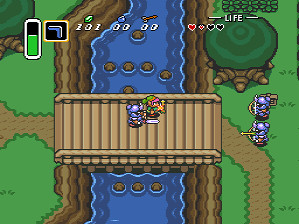 |
| beta | final |
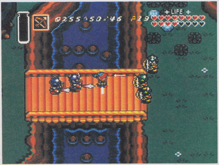 |
| comparison GIF |
This was another screen that was prominently displayed on the poster that was included with the SNES. In the beta, there are three archer soldiers and two blue chasing soldiers. In the final version, there are only two archers and one charging soldier in this area. All of the wandering archers in the final game have blue armour, in the beta, they are green. There are several other changes. There is one less rock in the bottom part of the river. The ledges have been extended to the bridge, so you can't jump into the water right beside the bridge. The wall on the right side of the screen has been extended downwards. The clump of several bushes and two rocks has been replaced by a tree. The sign does not exist in the beta. The flowers have been removed in the final version. The final version also includes dirt paths.
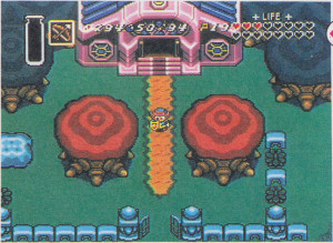
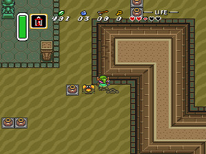
10) Eastern Palace
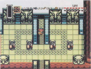 |  |
| beta | final |
 |
| comparison GIF |
In the entrance to the Eastern Palace, there are two fewer statue enemies in the final version. They also placed barriers to prevent you from jumping off the cliff at the stairs leading up to the palace. Also, looking at the bow and arrow item, the arrowhead was changed from white to yellow.
11) Desert of Mystery
 | 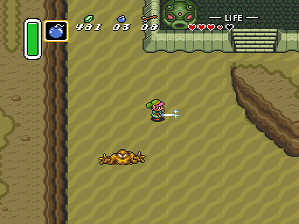 |
| beta | final |
 |
| comparison GIF |
The changes in this desert area are pretty minor. There is an extra rock on the ledge on the left. The octorock statue does not have the third eye. The texture on the platform with the ancient stone rune is also different.
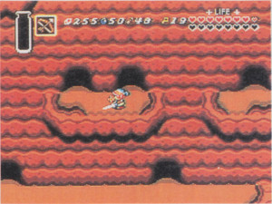
12) Desert Palace
 |  |
| beta | final |
Needless to say, the first area in the Desert Palace went under heavy revision for the final version. I believe that this is the area represented in the beta screenshot, and about the only thing that is the same is that there are pillars near the beamos, and that there leevers (although the purple variety). The colour scheme of the walls are different, and the tiles have a different texture.
13) River behind the Witch's Hut
 | 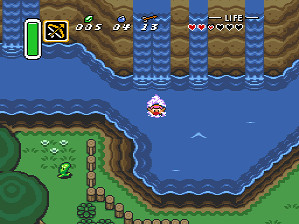 |
| beta | final |
 |
| comparison GIF |
This scene is petty much unchanged from the beta. There is one less buzzblob enemy, and there were some flowers added in that spot. There are two less bushes as well.
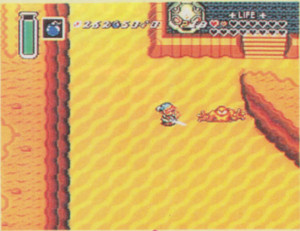
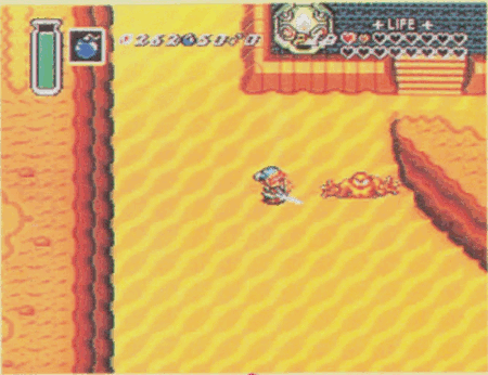
14) Death Mountain
 |  |
| beta | final |
The screenshot of Death Mountain has a bunch of caves. Since the beta shot has no exact equivalent in the final game, it is not really possible to make a direct comparison of the screenshots. The graphic tiles appear to be the same in the beta version.
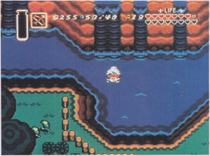
15) Master Sword
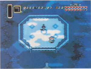 | 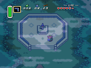 |
| beta | final |
 |
| comparison GIF |
The final screenshot shows the location of the Master Sword. The Master Sword pedestal got an overhaul in the final version to include some text that can be read by the Book of Mudora. The stairs have also been changed. The forest surrounding the Master Sword also has a different layout. The fog effects were in the beta version, but they appear to have been shifted a bit. One thing I didn't note before is that there were only 16 heart containers in the beta version, compared to 20 in the final game. It appears that Nintendo had things in debugging mode for all but the initial castle screens.
Download the Famicom Magazine scans